TensorFlow2.1入门学习笔记(2)——Matplotlib数据可视化
在正式学习tensorflow2.0之前需要有一定的python基础,对numpy,matplotlib等库有基本的了解,笔者还是AI小白,通过写博客来记录自己的学习过程,同时对所学的东西进行总结。主要学习的资料西安科技大学:神经网络与深度学习——TensorFlow2.0实战,北京大学:人工智能实践Tensorflow笔记博客从tf常用的库开始,需要学习python基础的朋友推荐菜鸟教程
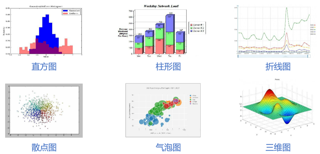
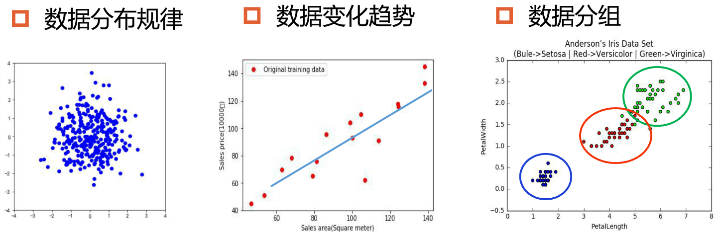
数据可视化: 数据分析阶段:理解和洞察数据之间的关系 算法调试阶段:发现问题,优化算法 项目总结阶段:展示项目成果 Matplotlib:第三方库,可以快速生成高质量图表
0.0.1 安装Matplotlib库
pip install -i https://pypi.tuna.tsinghua.edu.cn/simple matplotlib0.0.2 导入Matplotlib库
import matplotlib as plt #可用pyplot库绘制平面图,常用import matplotlib.pyplot as plt导入0.1 1.常用函数
figure对象:创建画布
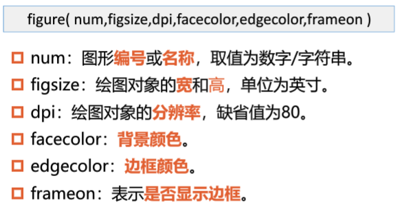
pit.figure(figsize=(3,2),facecolor="green")	#创建画布
plt.plot()			#绘制空白图形
plt.show()			#显示绘图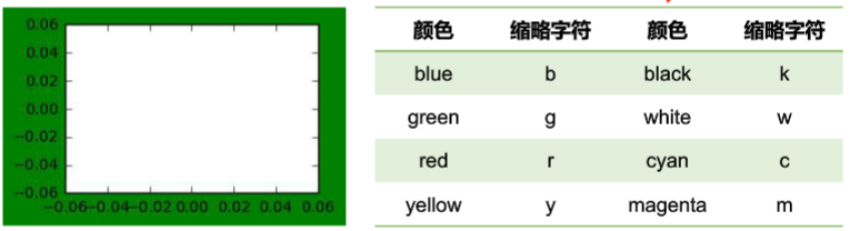
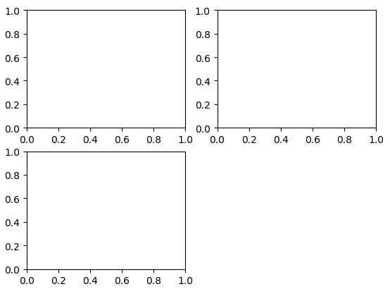
subplot()函数——划分子图 subplot(行数,列数,子图序号) 例:将画布划分为2x2的子图区域,并绘制3个子图
fig = plt.figure()
plt.subplot(2,2,1)
plt.subplot(2,2,2)
plt.subplot(2,2,3)
plt.show()
运行结果:
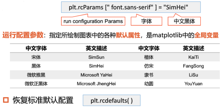
plt.rcParams[]——设置中文字体 matplotlib库中的文字为英文,如果需要中文时容易乱码,例如:使用plt.rcParams[“font.sans-serif”] = “SimHei"使默认字体改为中文。
无法正常显示时:
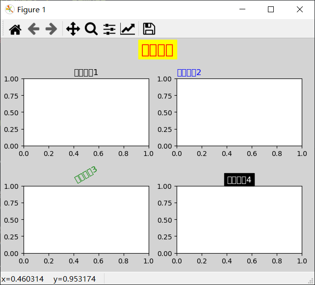
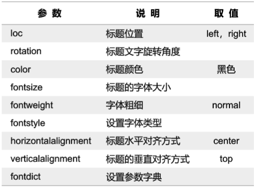
添加标题 添加全局标题:suptitle(标题文字) 添加子标题:title(标题文字) suptitle()函数的主要参数:
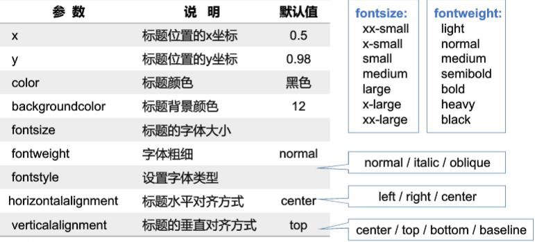
title()函数的主要参数:
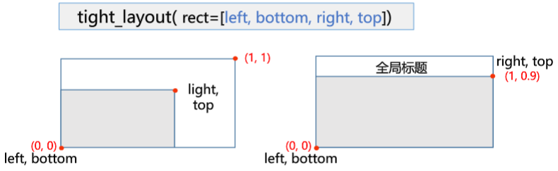
tight_layout()函数 检查坐标轴标签、刻度标签和子图标题,自动调整子图,使之填充整个绘图区域,并消除子图之间的重叠
SUMMARIZE:
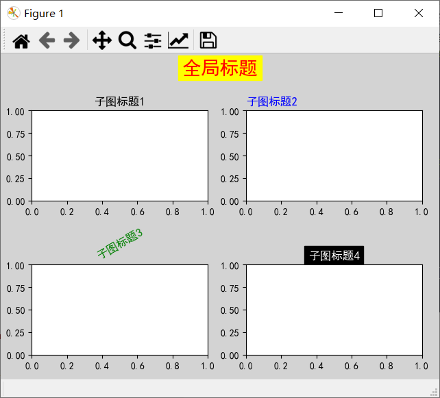
import matplotlib.pyplot as plt

plt.rcParams["font.family"] = "SimHei"
fig = plt.figure(facecolor = "lightgrey")
plt.subplot(2,2,1)
plt.title('子图标题1')
plt.subplot(2,2,2)
plt.title('子图标题2',loc="left",color="b")
plt.subplot(2,2,3)
myfontdict = {"fontsize":12,"color":"g","rotation":30}
plt.title('子图标题3',fontdict=myfontdict)
plt.subplot(2,2,4)
plt.title('子图标题4',color = "white",backgroundcolor="black")

plt.suptitle("全局标题",fontsize=20,color="red",backgroundcolor="yellow")
plt.tight_layout(rect=[0,0,1,0.9])
plt.show()
运行结果:
0.2 2.散点图(Scatter)
数据点在直角坐标系中的分布图
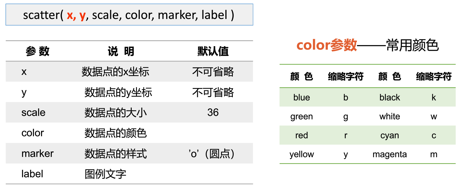
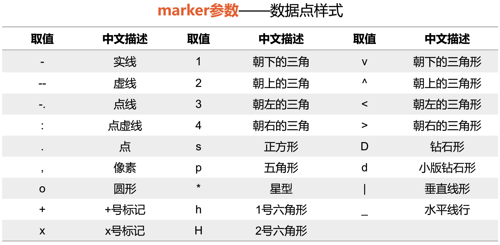
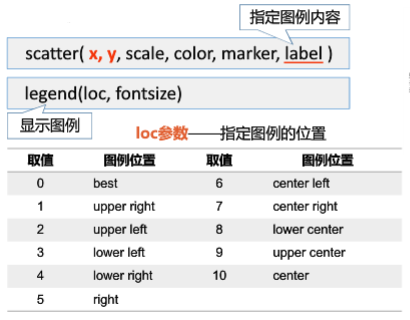
scatter()函数
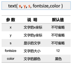
text()函数 添加文字
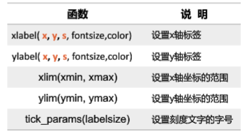
xlabel(),ylabel()函数 设置坐标轴
增加图例
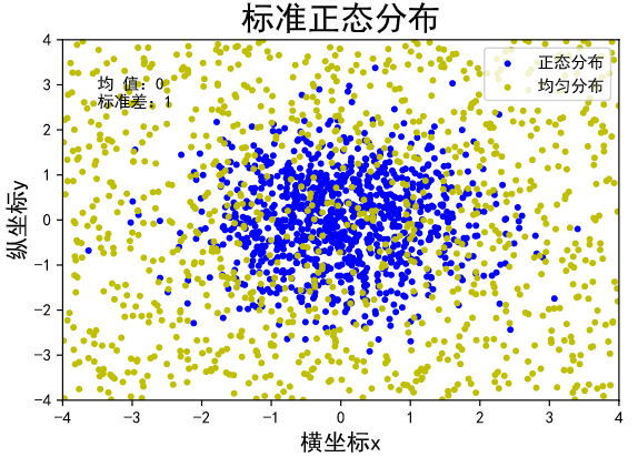
绘制标准正态分布,均匀分布的散点图
import matplotlib.pyplot as plt
import numpy as np

plt.rcParams["font.sans-serif"]="SimHei"    #设置中文字体为默认字体
plt.rcParams["axes.unicode_minus"]=False    #使“-”正常显示

n = 1024                    #随机点个数:1024
x = np.random.normal(0,1,n) #生成数据点x坐标
y = np.random.normal(0,1,n) #生成数据点y坐标

plt.scatter(x,y,color="blue",marker=".")       #绘制数据点
plt.title("标准正态分布",fontsize=20)           #设置标题
plt.text(2.5,2.5,"均 值:0\n标准差:1")         #显示文本
plt.xlim(-4,4)  #x轴范围
plt.ylim(-4,4)  #y轴范围

plt.xlabel('横坐标x',fontsize=14)   #x轴名称
plt.ylabel('纵坐标y',fontsize=14)   #y轴名称

plt.show()  #显示
运行结果:
0.3 3.折线图(Line Chart)
在散点图的基础上,将相邻的点用线段连接,描述变量变化的趋势
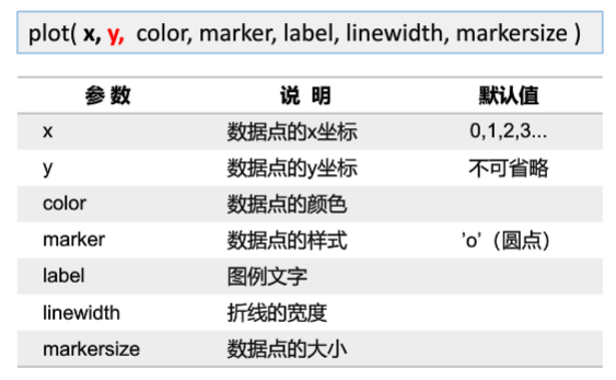
plot()函数
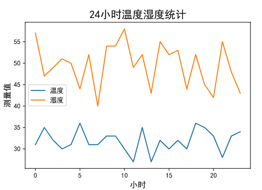
绘制温度和湿度数据折线图
import matplotlib.pyplot as plt
import numpy as np

plt.rcParams["font.sans-serif"]="SimHei"

n = 24
y1 = np.random.randint(27,37,n)		#生成随机数据
y2 = np.random.randint(40,60,n)

plt.plot(y1, label="温度")			#绘制
plt.plot(y2, label="湿度")
plt.xlabel("小时",fontsize=12)
plt.ylabel("测量值",fontsize=12)

plt.title("24小时温度湿度统计",fontsize=16)

plt.legend()
plt.show()
运行结果
0.4 4.柱形图(Bar Chart)
由一系列高度不等的柱形图条纹表示数据分布的情况
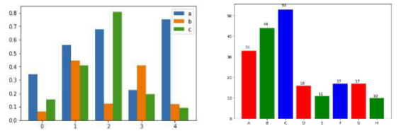
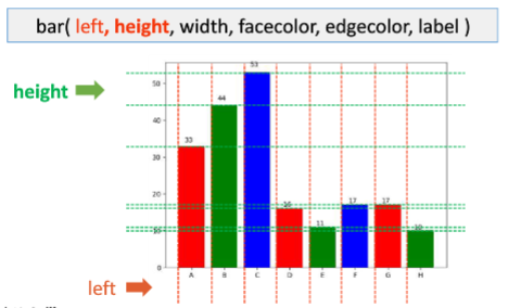
bar()函数
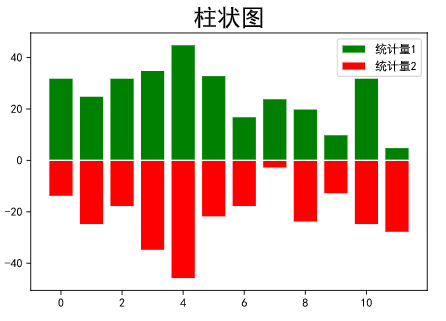
绘制柱形图
import matplotlib.pyplot as plt
import numpy as np

plt.rcParams["font.sans-serif"]="SimHei"    #设置中文字体为默认字体
plt.rcParams["axes.unicode_minus"]=False    #使“-”正常显示

y1 = [32,25,32,35,45,33,17,24,20,10,32,5]
y2 = [-14,-25,-18,-35,-46,-22,-18,-3,-24,-13,-25,-28]
plt.bar(range(len(y1)),y1,width=0.8,facecolor="g",edgecolor="w",label="统计量1")
plt.bar(range(len(y2)),y2,width=0.8,facecolor='r',edgecolor='w',label="统计量2")
plt.title("柱状图",fontsize=20)
plt.legend()
plt.show()
运行结果